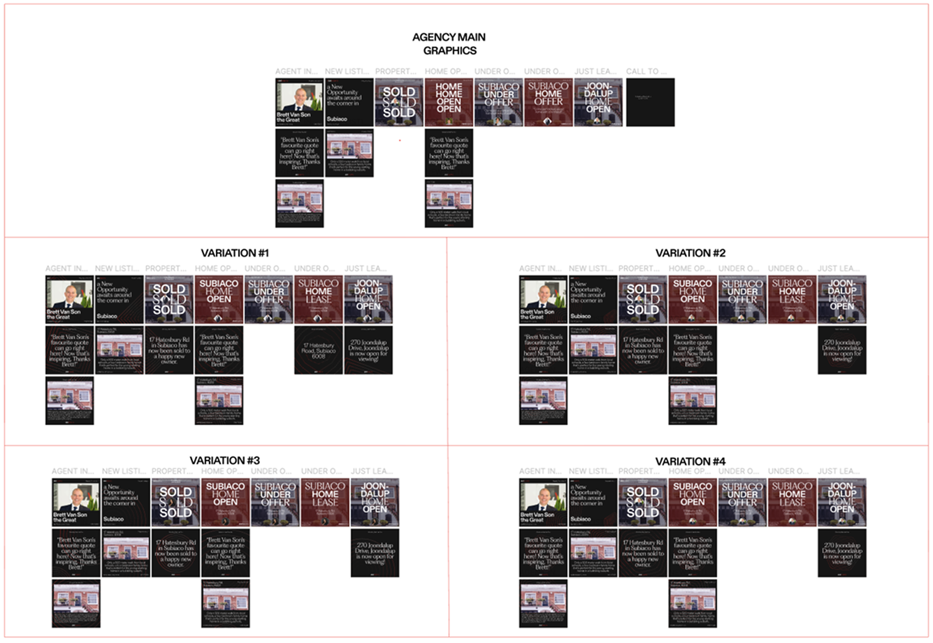
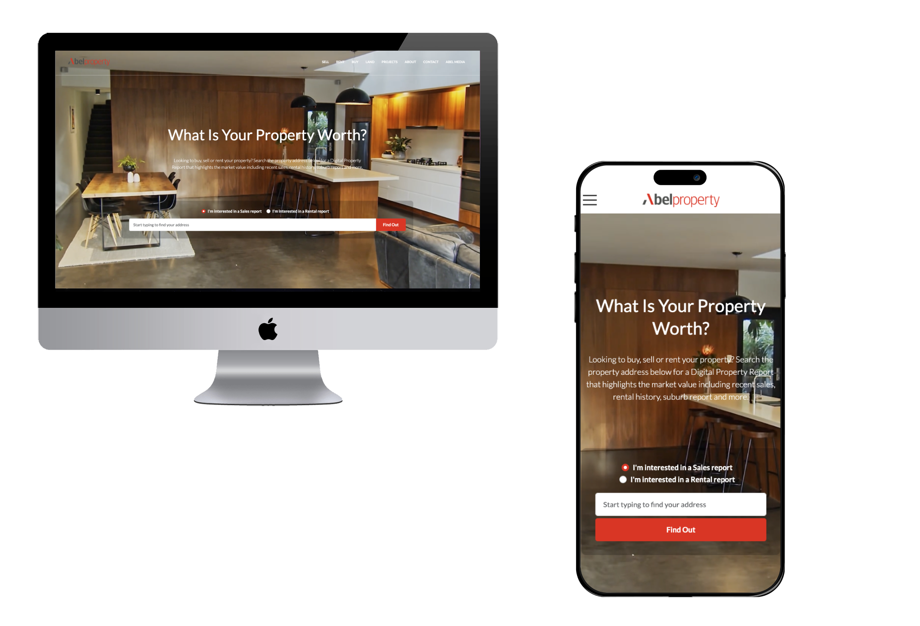
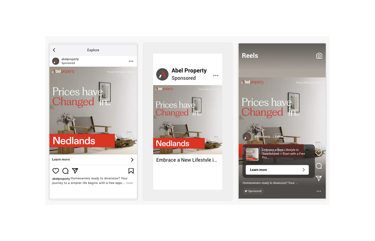
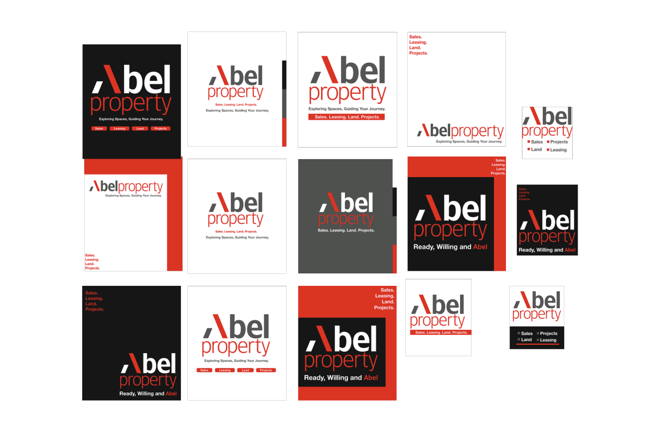
We rebranded Abel Property with a crisp, modern aesthetic tailored to Perth’s western suburbs. Their previous content felt outdated and lacked impact, so we introduced a bold, minimal style with strong typography and sharp alignment. Red accents were used sparingly to draw the eye to key info like locations or agent names, perfect for fast-scrolling users. Posts are now clean and consistent, with a structured grid layout that makes it easy to digest listings, agent intros, or campaign messages. This new identity reflects both sophistication and clarity, an ideal match for the high-expectation clientele of the western suburbs, while standing out in busy property feeds

