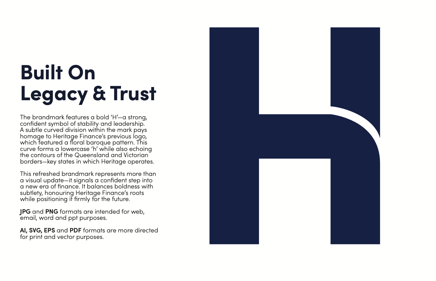
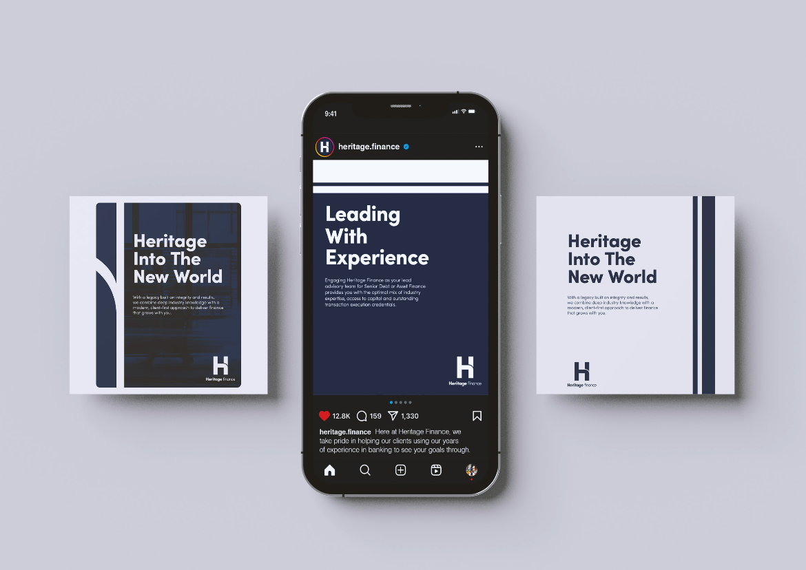
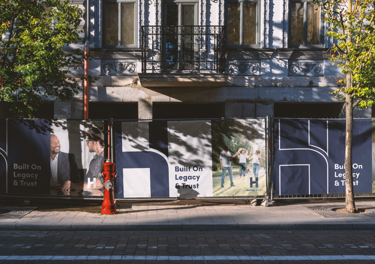
Heritage Finance’s rebrand was more than a facelift—it was a strategic shift in identity. We created a bold new ‘H’ brandmark symbolising strength, stability, and leadership, while subtly nodding to the company’s legacy through a curved division inspired by their previous floral logo. This curve also echoes the borders of Queensland and Victoria, grounding the brand in its geographic roots. Paired with a refined colour system and tailored collateral across digital and print, the new brand now balances modernity with heritage—positioning Heritage Finance as a confident, future-ready player in the finance space.
Heritage Finance
Heritage Finance is your trusted partner across equipment finance, property finance, M&A advisory, and debt advisory. With a commitment to tailored outcomes, we support clients in securing machinery, acquiring property, navigating mergers and acquisitions, and optimising debt structures. Backed by a team of experienced brokers and a track record of strategic results, we offer clear, actionable financial solutions designed to help you grow with confidence.
SERVICES PROVIDED ~
BRANDING
WEBSITE DEVELOPMENT
PAID ADS
VISUAL ASSETS CREATION
TRACKING INFRASTRUCTURES
Identify:
Heritage Finance is a trusted Australian finance brokerage providing tailored lending solutions across residential, commercial, private, and asset finance. With a growing client base and an expanding service offering, they needed a clearer, more modern brand presence—one that would match the professionalism of their work and help audiences instantly identify the right division for their needs.
Problem:
The Heritage brand had become visually outdated and too generalised. With all finance arms sharing a single identity, it created confusion for clients navigating between commercial, residential, and private lending. Their website lacked clear messaging, strong visuals, and performance tracking—limiting both conversion and audience insight. Without distinct branding or analytics, it was difficult to create effective marketing campaigns or streamline customer journeys.
Solution:
-
Rebranded the entire company with a modernised look to reflect professionalism and clarity.
-
Introduced four distinct colour-coded sub-brands (Residential, Commercial, Private, Asset Finance) to improve audience segmentation and recognition.
-
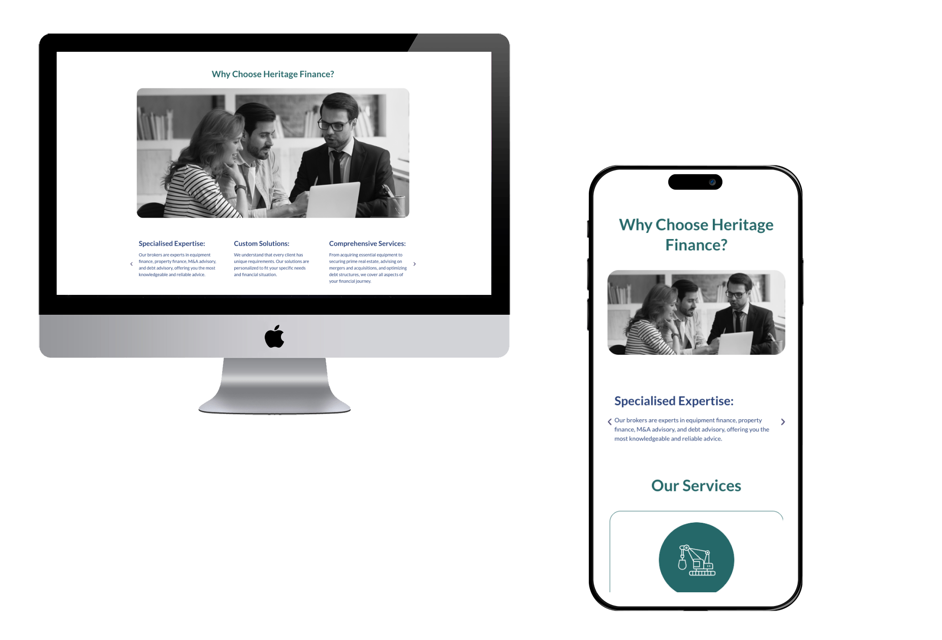
Developed a new website with updated layout, refined copywriting, and sector-specific content to improve user navigation and engagement.
-
Implemented full tracking infrastructure, including GA4, tag management, and source attribution, to enable better audience understanding and campaign readiness.
-
Designed visual assets including new logos, branded templates for each division, digital signatures, email footers, and apparel like staff shirts.
-
Positioned the brand for marketing growth, laying the groundwork for effective paid ads and clearer digital communication.