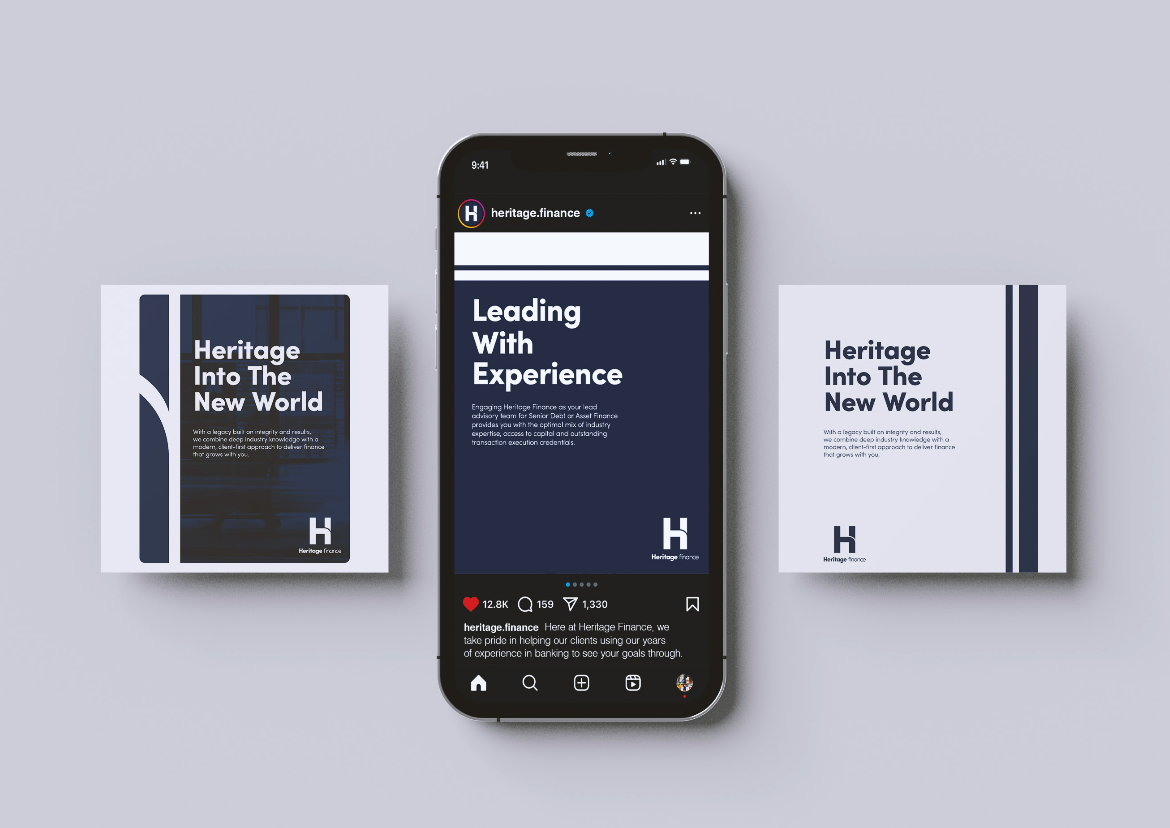
Heritage Finance’s rebrand was more than a facelift—it was a strategic shift in identity. We created a bold new ‘H’ brandmark symbolising strength, stability, and leadership, while subtly nodding to the company’s legacy through a curved division inspired by their previous floral logo. This curve also echoes the borders of Queensland and Victoria, grounding the brand in its geographic roots. Paired with a refined colour system and tailored collateral across digital and print, the new brand now balances modernity with heritage—positioning Heritage Finance as a confident, future-ready player in the finance space.